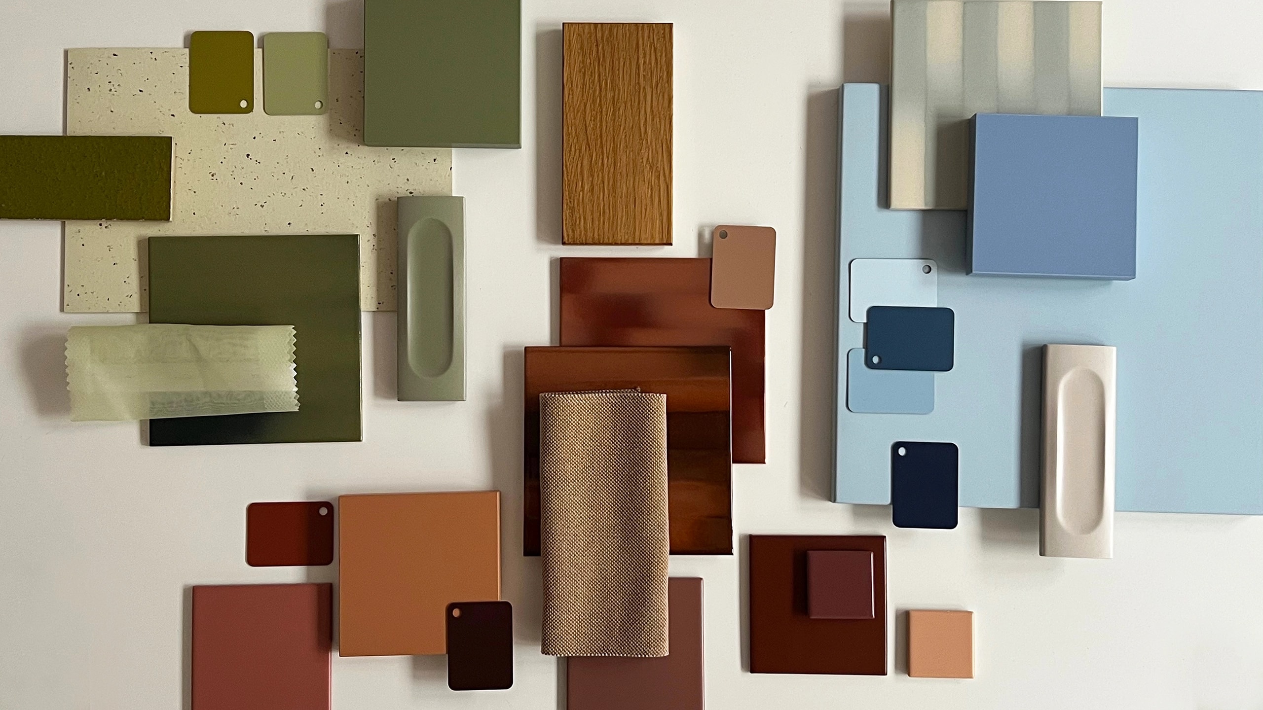
Our overriding goal in designing the interiors of the first floor and ground floor of the building at Targ Rakowy 5/6 in Gdańsk was to create inclusive, open and unintimidating spaces — places accessible to all users, regardless of age, needs or how they use the library. Flexibility was key for us: functional flexibility, allowing the library to carry out its current tasks, and future-proofing, allowing it to adapt smoothly to new activities, ways of working and forms of participation. To achieve this, we built the concept on a deliberate use of colour theory and its effects — it is colour that became the foundation of the visual and emotional coherence of the entire project. In interior design, colour does not play a merely aesthetic role — it is one of the key means of influencing users' perception, wellbeing and behaviour. Colour theory describes the relationships between colours, their influence on how a space is perceived and the psychophysical reactions they provoke. A well-chosen palette can aid concentration, calm or stimulate, bring order to a space or guide movement through it. In a library — a place that brings together diverse activities, from work and study through recreation to meetings and events — colour becomes an ally in building mood, functional zoning and an intuitive interior. On this basis we chose three signature colours with strong yet complementary properties: brick red, green and blue. Each carries different meanings, supports a different type of activity and helps shape the character of the place. Set alongside one another, these colours allow the spaces to differ in mood while retaining a cohesive, harmonious identity.
layout 1
layout 2
Brick red: Brick red brings warmth, cosiness and a sense of closeness to the interior. It encourages relaxation and an intimate atmosphere, invites calm interaction and gives an impression of naturalness. It evokes authenticity, the earth and traditional values, creating friendly surroundings. Blue: Blue lends the space freshness, harmony and a feeling of breathing room. It soothes the emotions, aids concentration and supports logical thinking, creating ideal conditions for mental work. It inspires trust and a sense of stability, bringing a modern, professional character. Green: Green has a calming, harmonising effect, letting the eye rest and creating an atmosphere of tranquillity. It fosters focus and gently orders the space without imposing itself on the user. As a colour tied to nature, it brings freshness, authenticity and a sense of balance to the interior. Together, the chosen palette — brick red, green and blue — forms a multidimensional visual language that supports the idea of the library as an open, friendly and flexible space. Each colour performs a specific role, answering the needs of different user groups and types of activity. This deliberate work with colour produces an interior that not only meets functional requirements but, above all, builds an experience — calm, safe, inspiring and accessible to everyone.
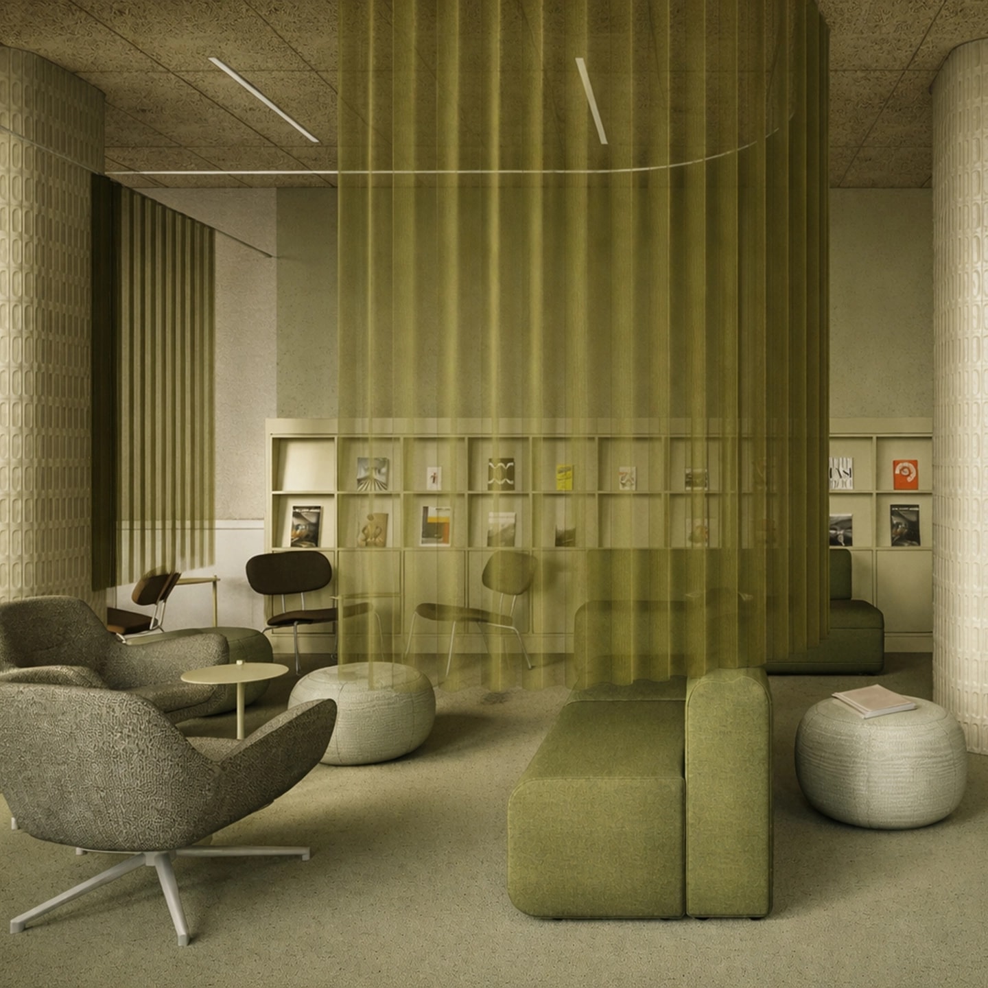
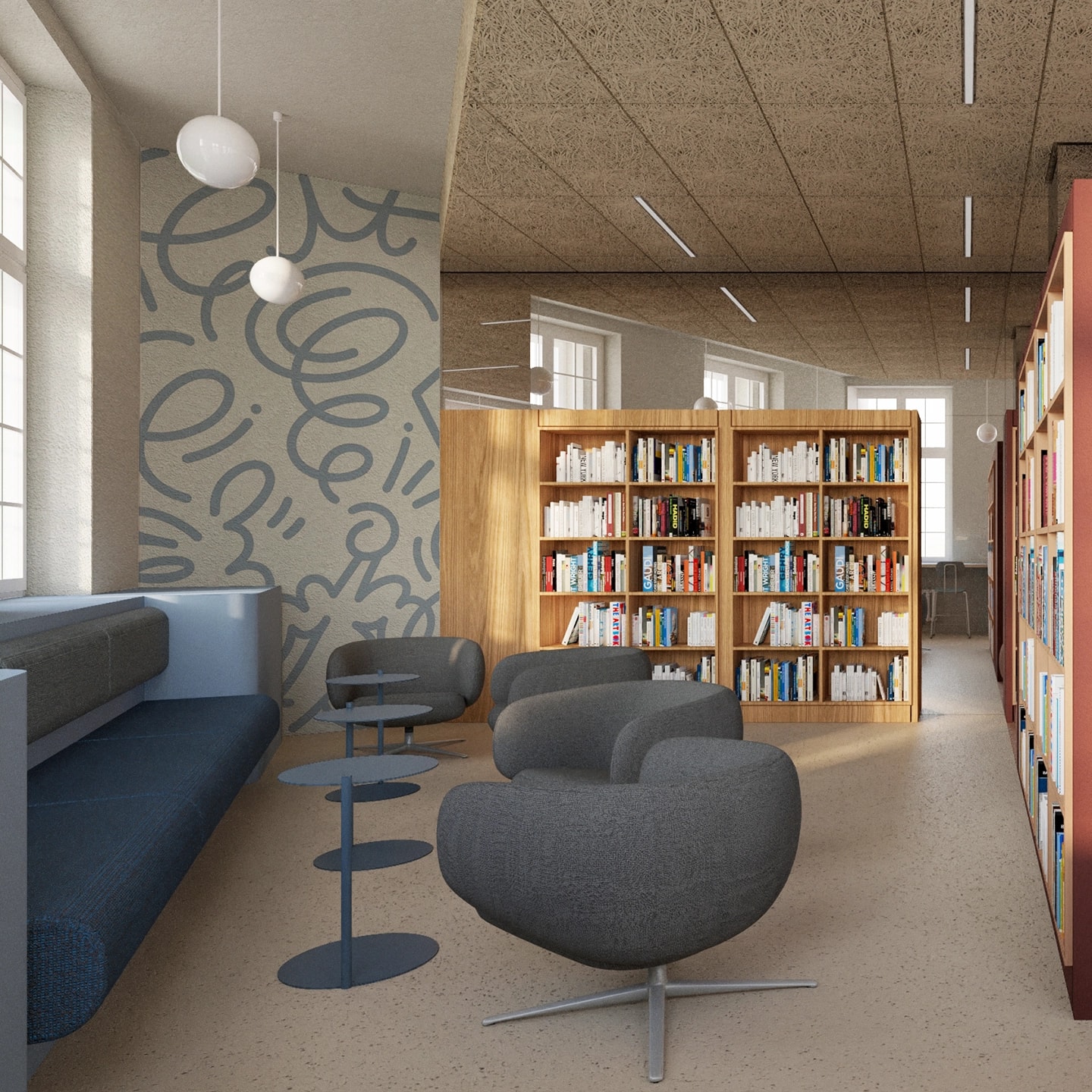
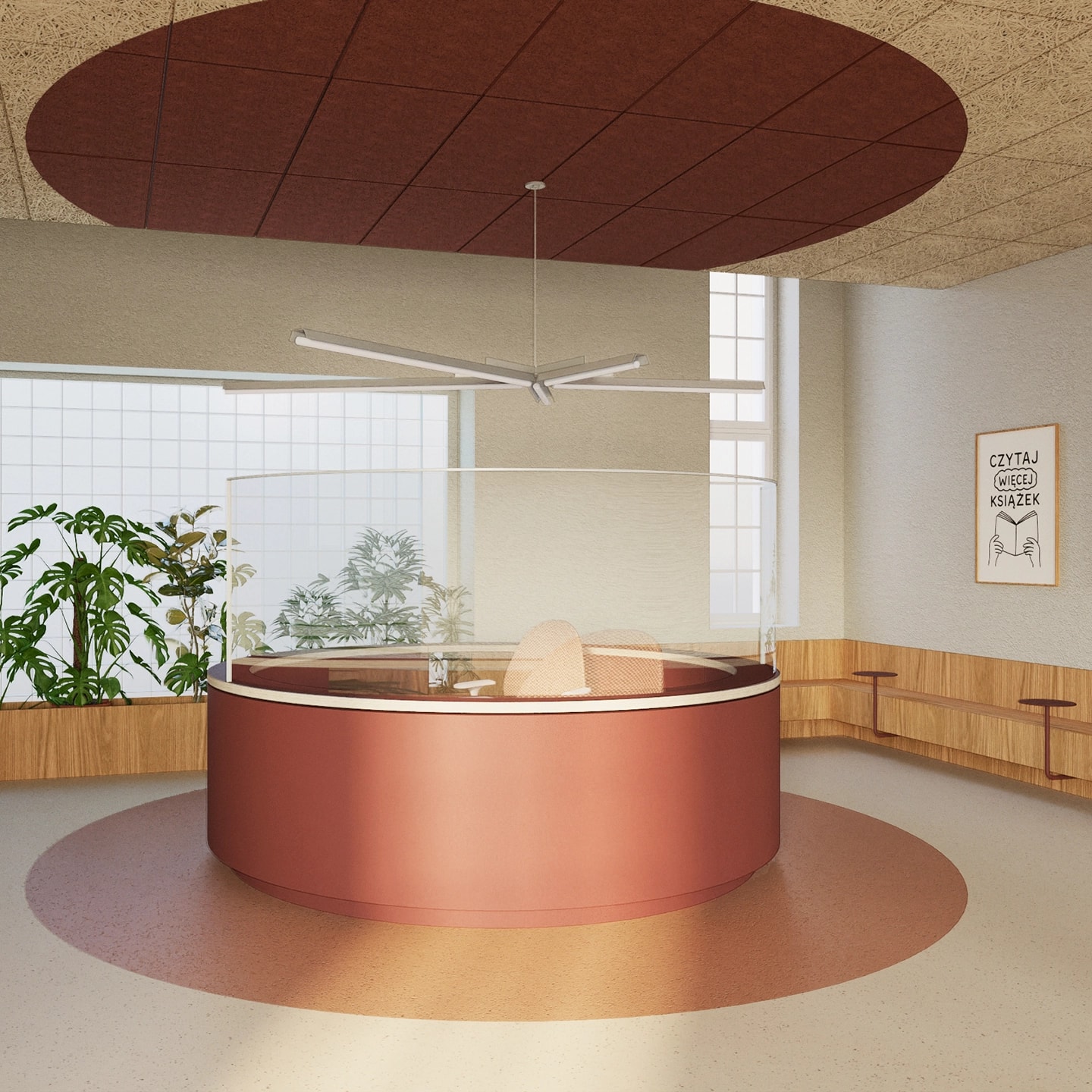
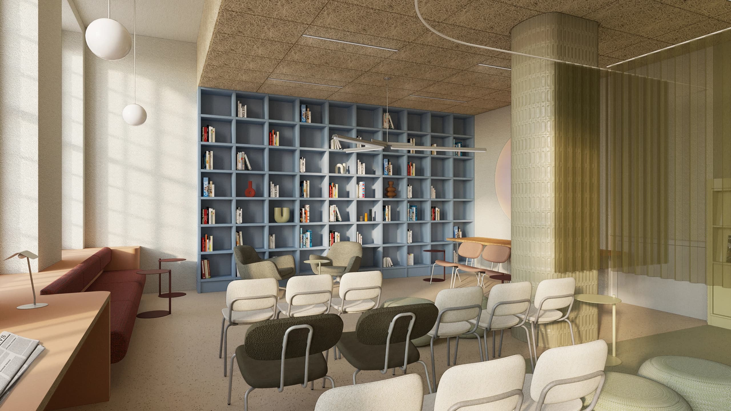
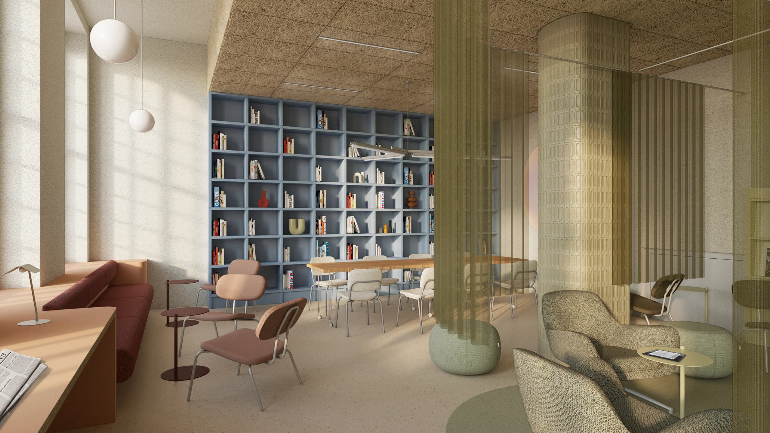
The ground floor serves as the library's representative and most accessible part, so we planned it as a space that is open, legible and welcoming from the very first step. In the entrance zone we used brick red as the signature colour; its warmth and naturalness create an atmosphere of hospitality and break down the formality typical of public institutions. The colour reinforces a sense of closeness and makes for a comfortable threshold for users. At the centre, directly opposite the door, a round reception desk organises circulation and forms the first point of contact. Its form is inclusive and approachable from every side, and its soft, rounded shapes follow the principle of an unintimidating space. Directly behind the desk sits a planter with lush greenery, introducing an element of nature and creating a visual accent that softens the entrance area. Benches are arranged around this central section, offering a moment's rest; the deeper one moves into the ground floor, the softer the seating becomes, inviting a longer stay. To the right of the reception is a quiet work room, where we applied blue as the signature colour — conducive to concentration, focus and creativity. Thanks to furnishings that adapt easily to different needs, this space can also serve as a small conference or meeting room. To the left of the entrance lies the reading-room zone, kept in a green palette. It is a calm, natural and flexible space. Here we used sheer curtains that subtly section off smaller, more intimate areas without losing lightness or the flow of daylight. The reading room is furnished with small sofas and workspaces at a long counter beneath the windows. All the remaining furniture is mobile, so the space can be rearranged quickly and easily — even for larger cultural events. The zone culminates in a tall bookcase that acts as a backdrop for talks, conversations and gatherings while visually ordering the space.
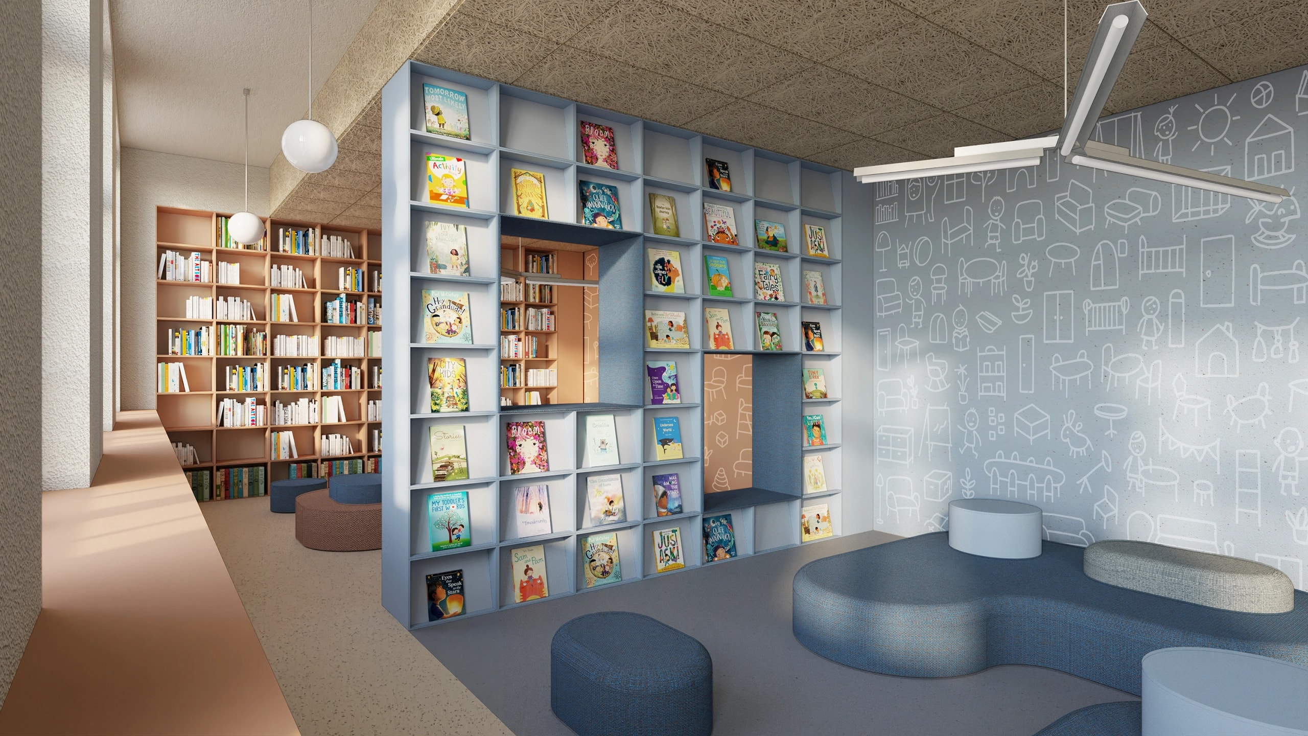
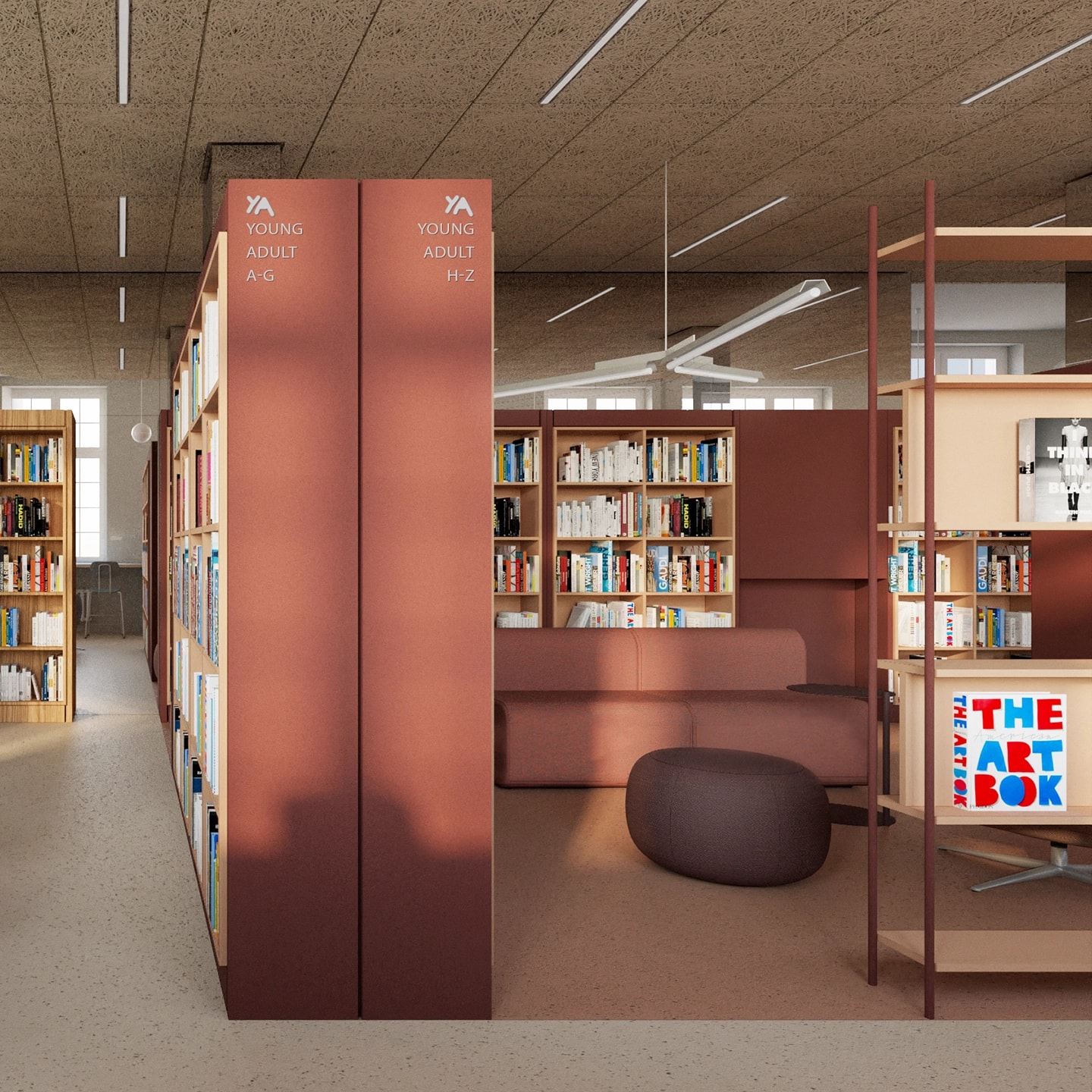
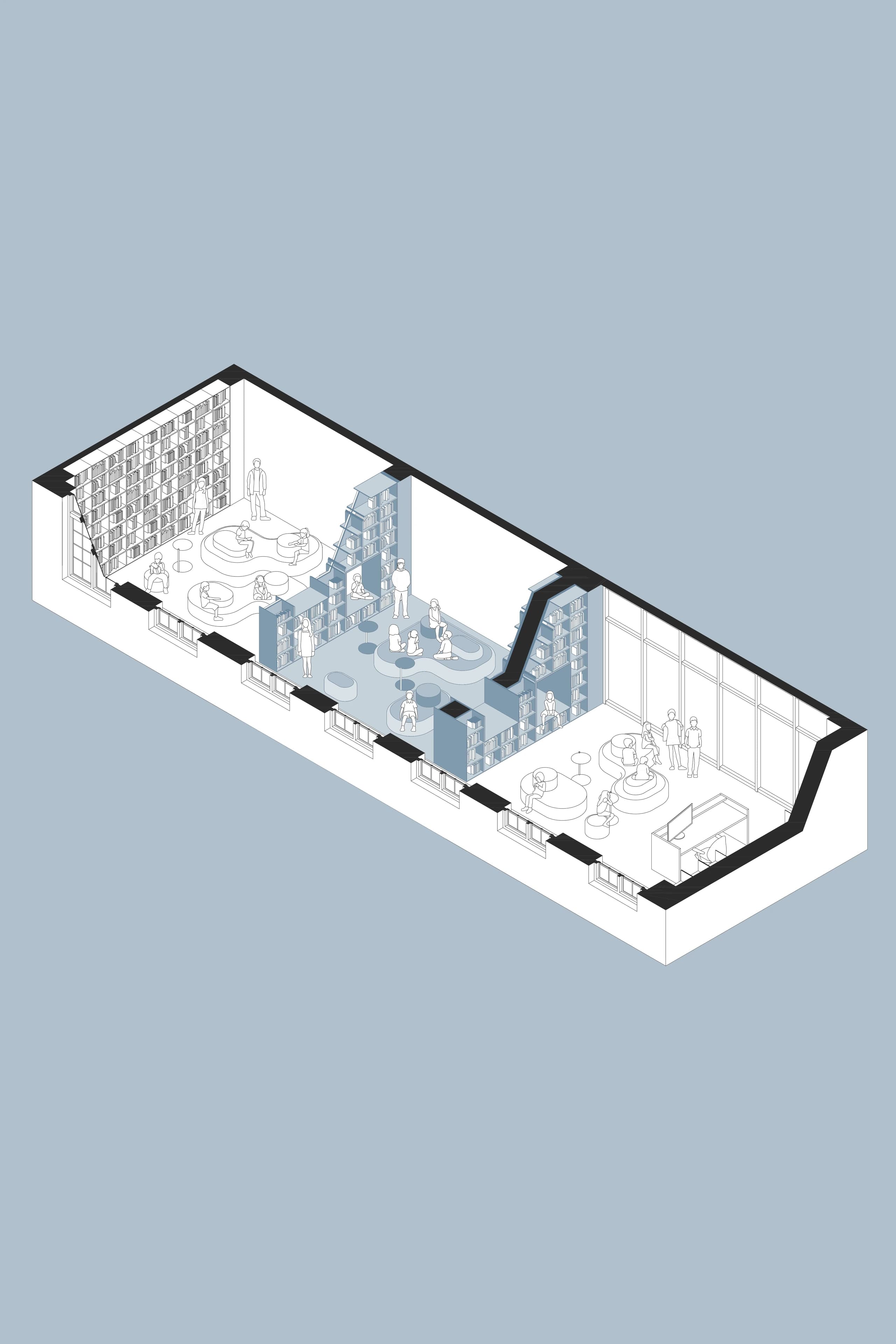
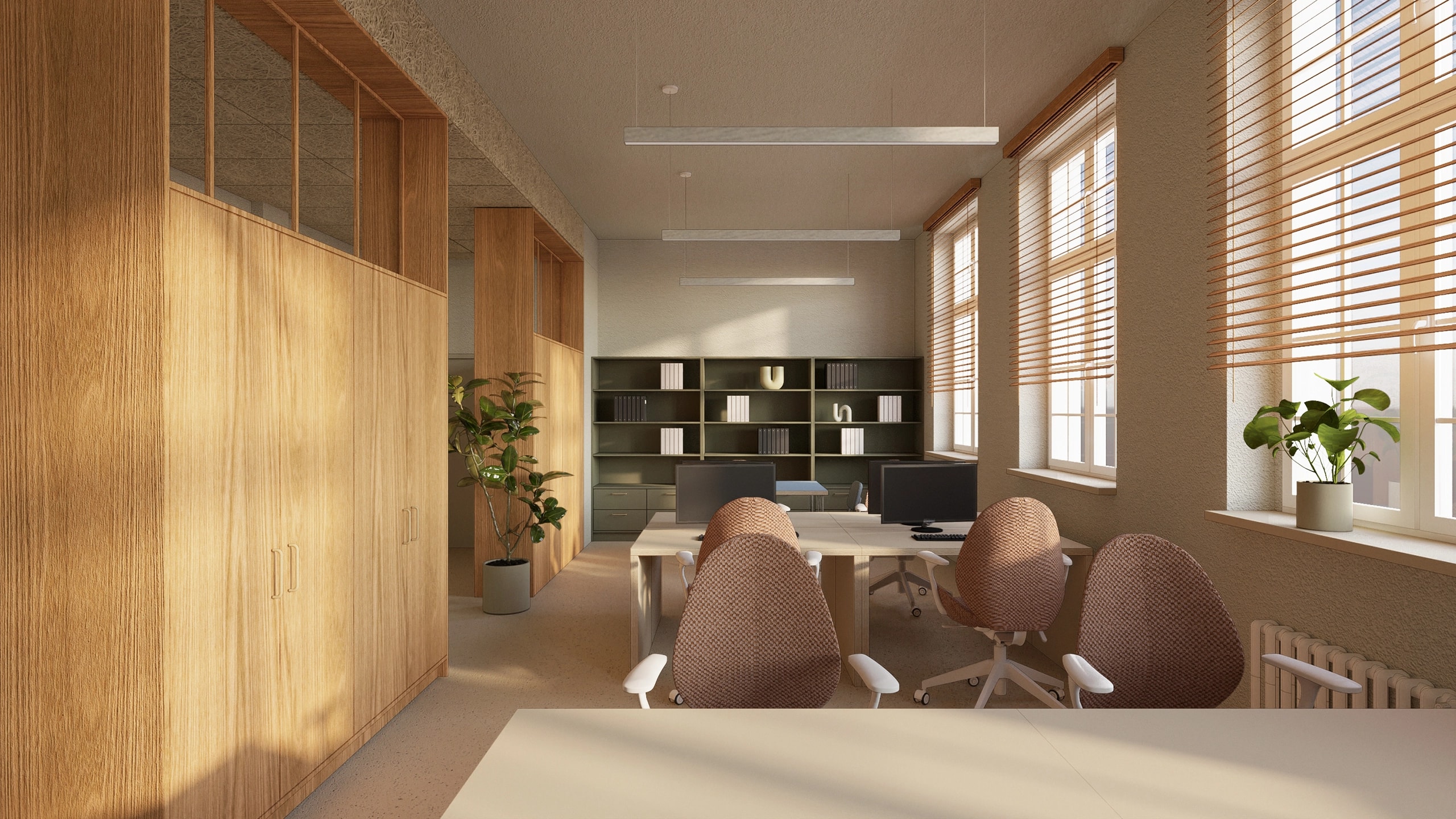
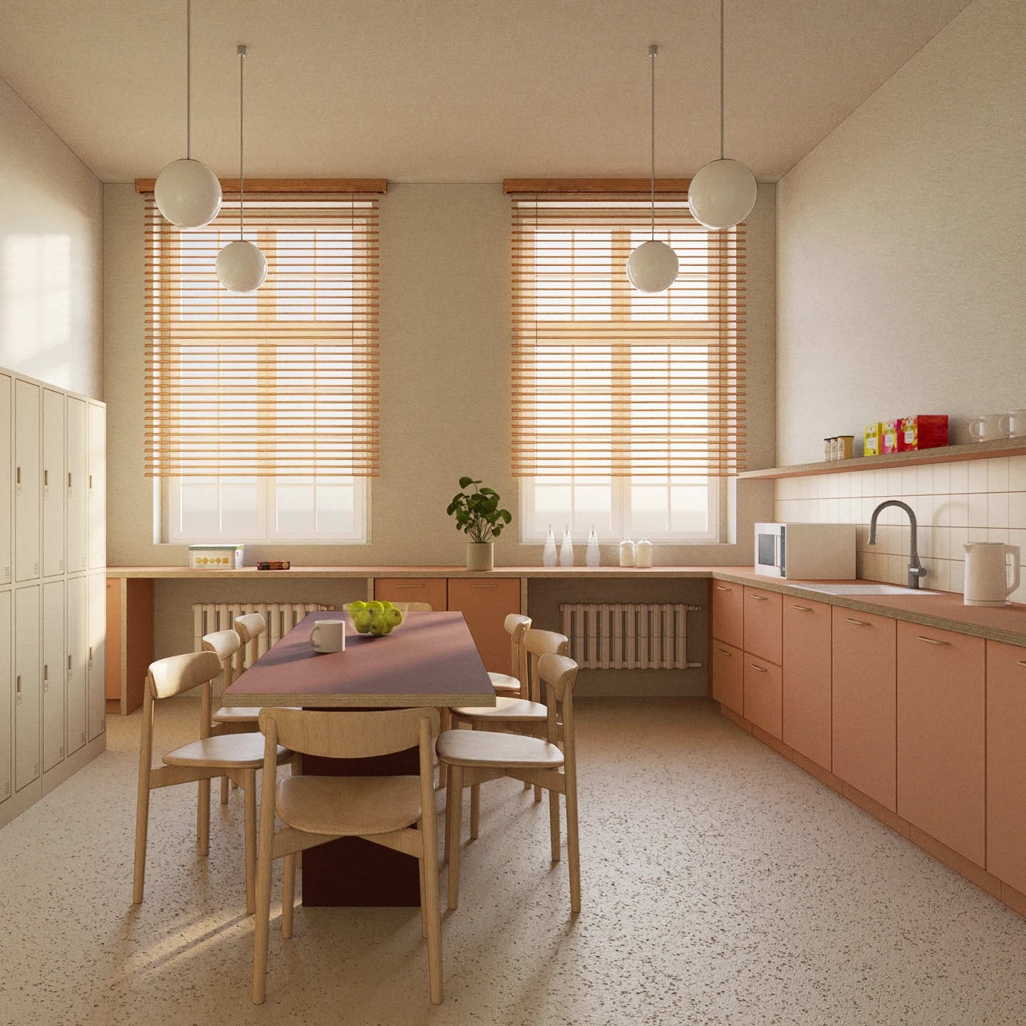
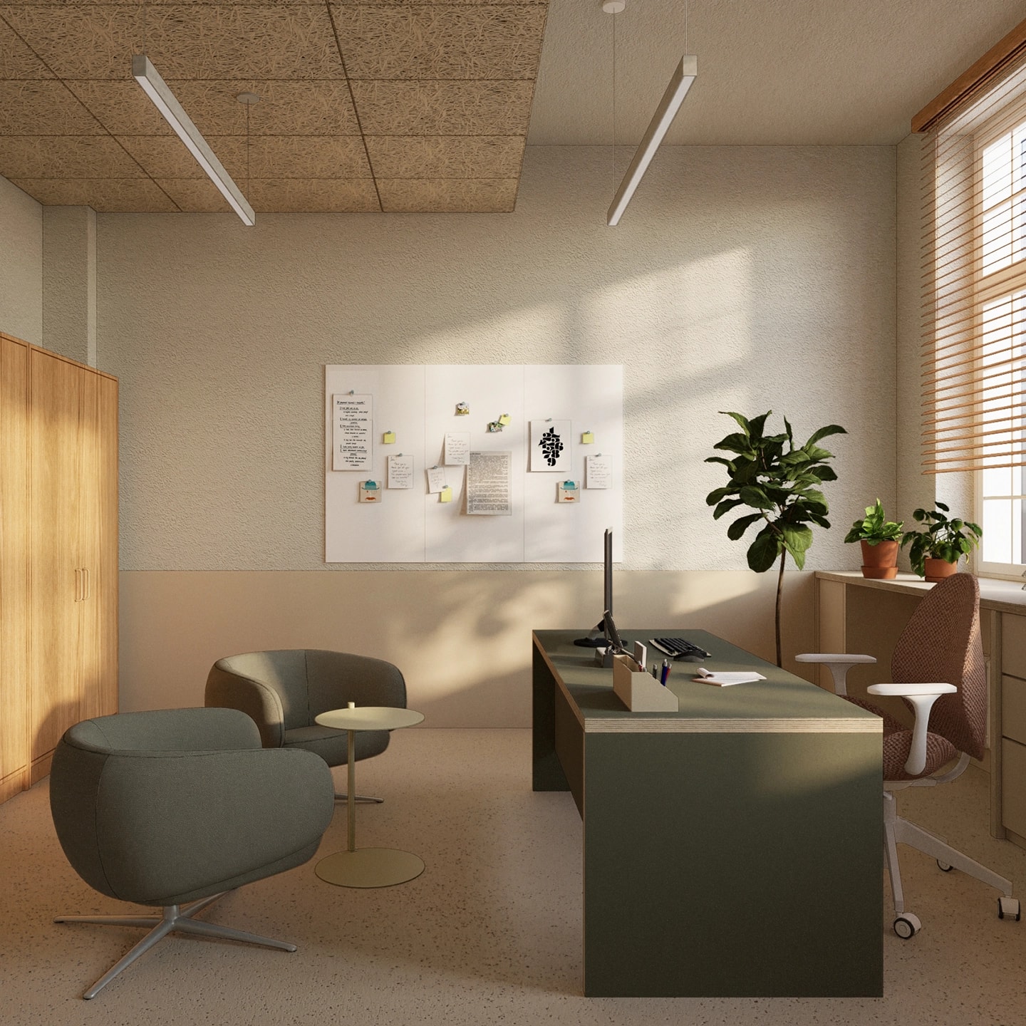
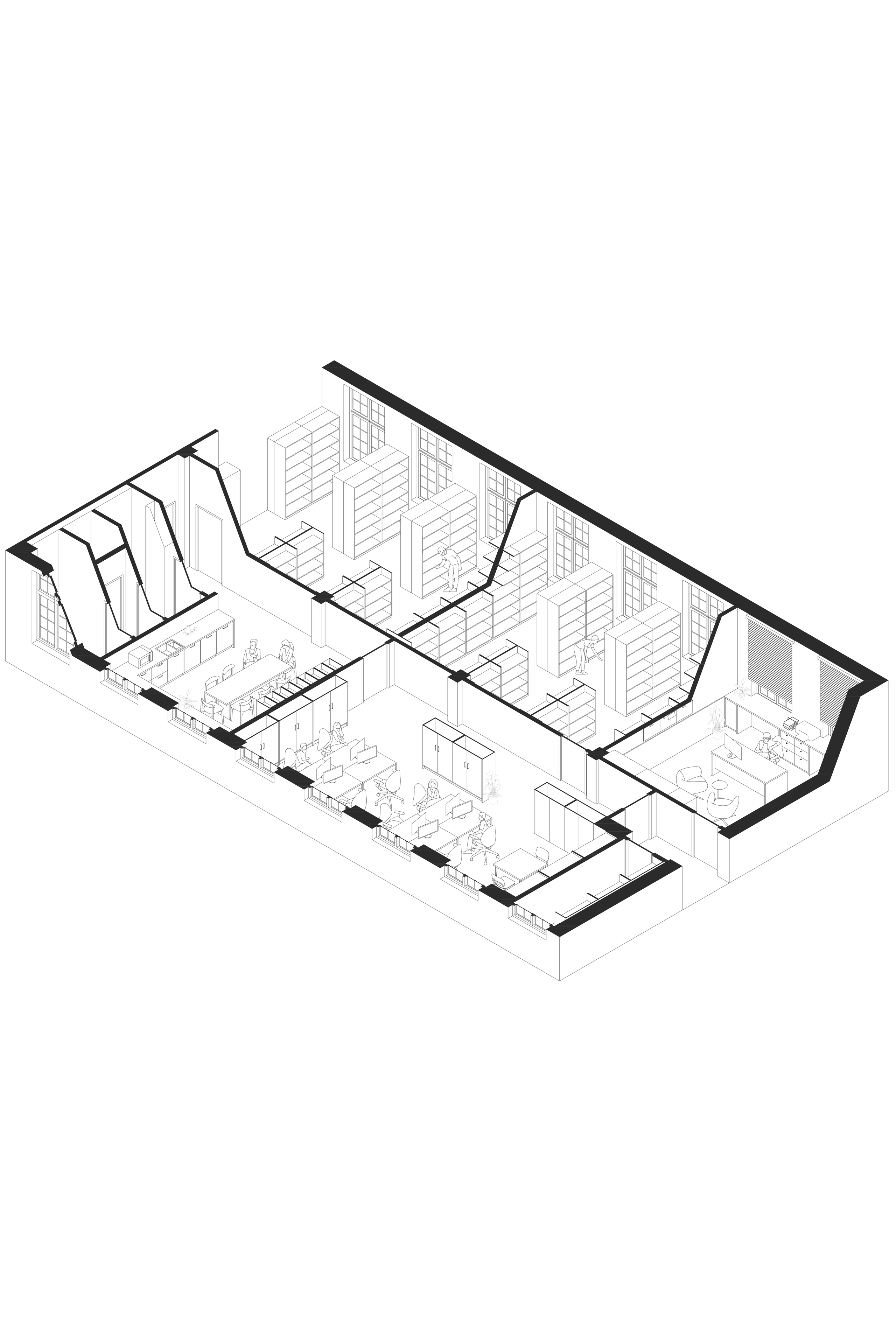
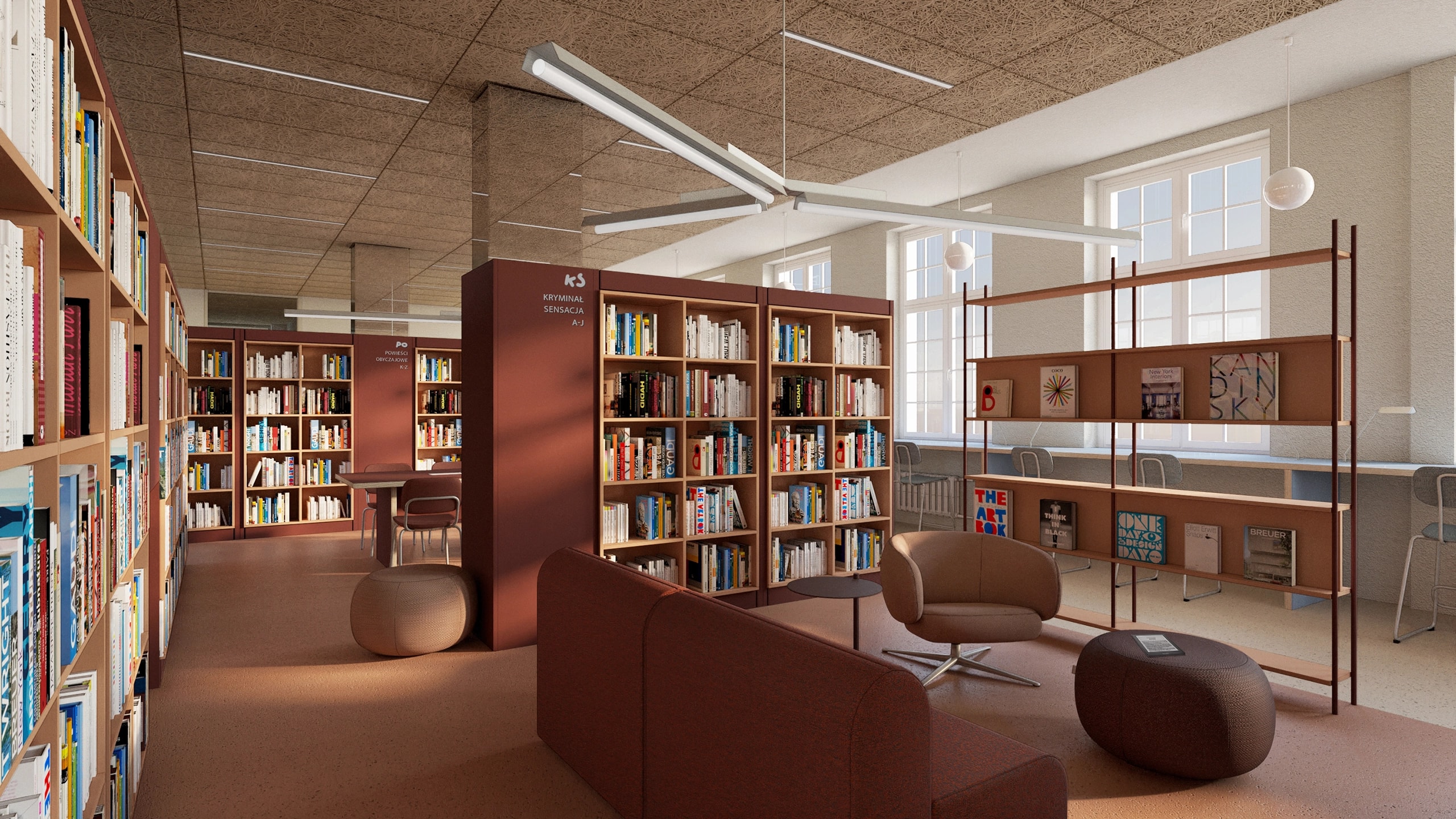
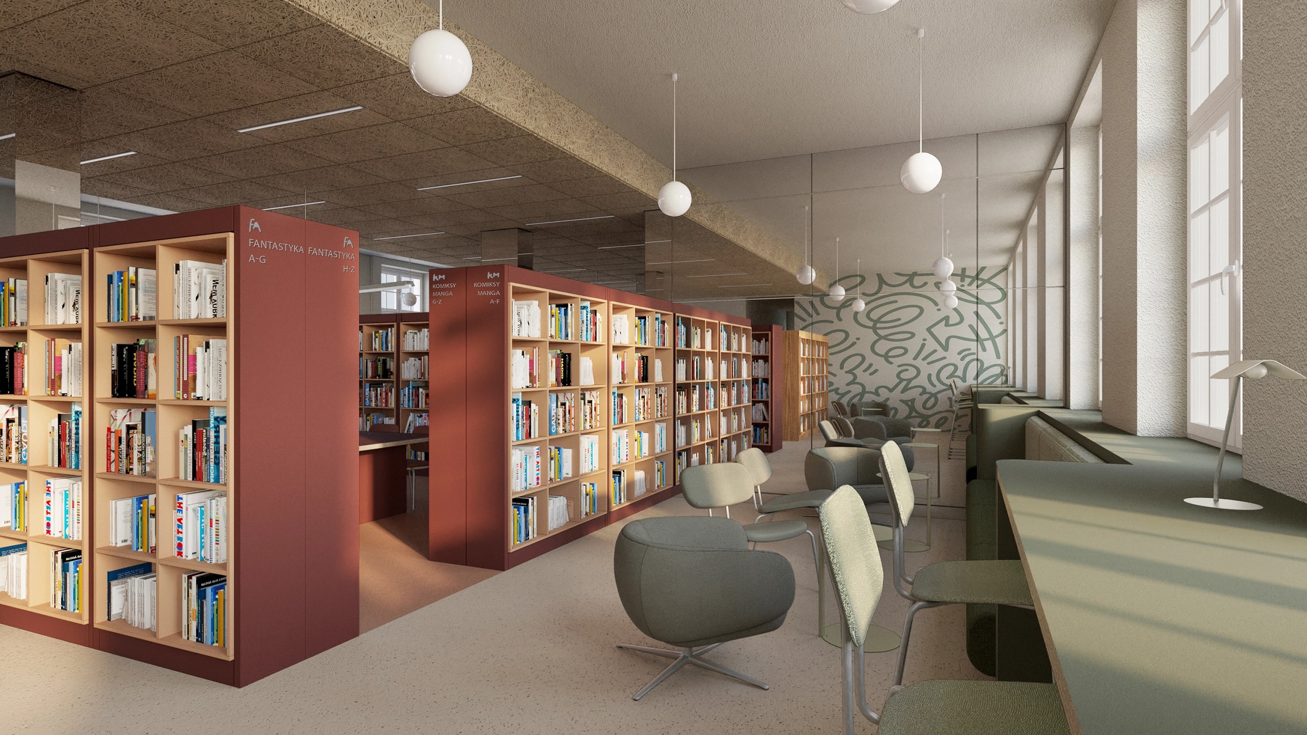
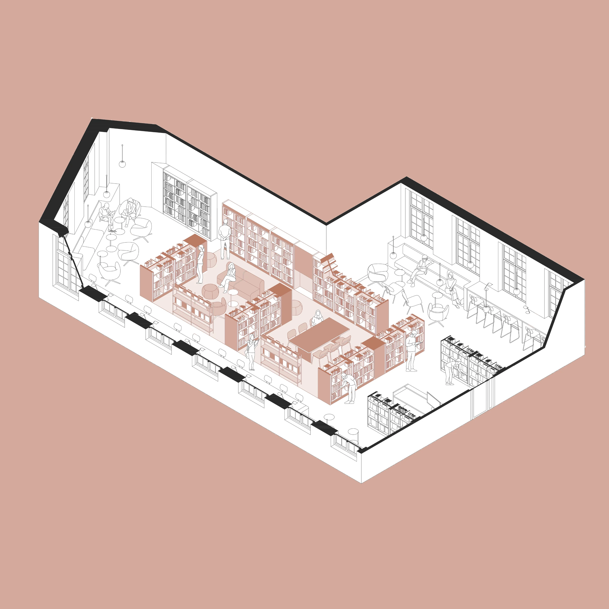
The library's first floor is divided into two clear functional zones, corresponding to different user groups and their needs. The design envisions flexible, friendly spaces that support both work and rest, as well as appropriate back-of-house facilities for staff. The right wing houses the youth media library, where the main signature colour is brick red. Its warmth builds a relaxed atmosphere and encourages young users to spend time here. The central part of this zone is divided by bookcases, creating more intimate interiors: a long table for working, meeting and playing games, and soft furniture that invites reading and rest. Along the windows there are work counters with individual lighting, with provision for plugging in a tablet or laptop. Soft small sofas and comfortable armchairs with side tables also appear here, forming cosy micro-spaces. A distinctive touch is the mirrored cladding above the bookcases, which visually enlarges the interior and lends it lightness. The left wing holds the children's library, designed in a signature blue that fosters focus, calm and a sense of security. Tall bookcases divide the space into smaller areas friendly to the youngest visitors, and seating windows set into their structure frame views and create inviting places to read. Upholstered seats with soft, rounded shapes complete the whole — safe and inviting for play and rest. Opposite the children's library is a relaxation zone for children, in brick red. It holds a low bookcase and soft elements that encourage play and exploration. This part of the floor also includes a dedicated therapy room, intended for people of various ages, including those on the autism spectrum. It is designed in a soothing green to support a sense of safety and sensory comfort. The remainder of the left wing is occupied by a suite of staff, office and storage rooms that form the library's back-of-house.