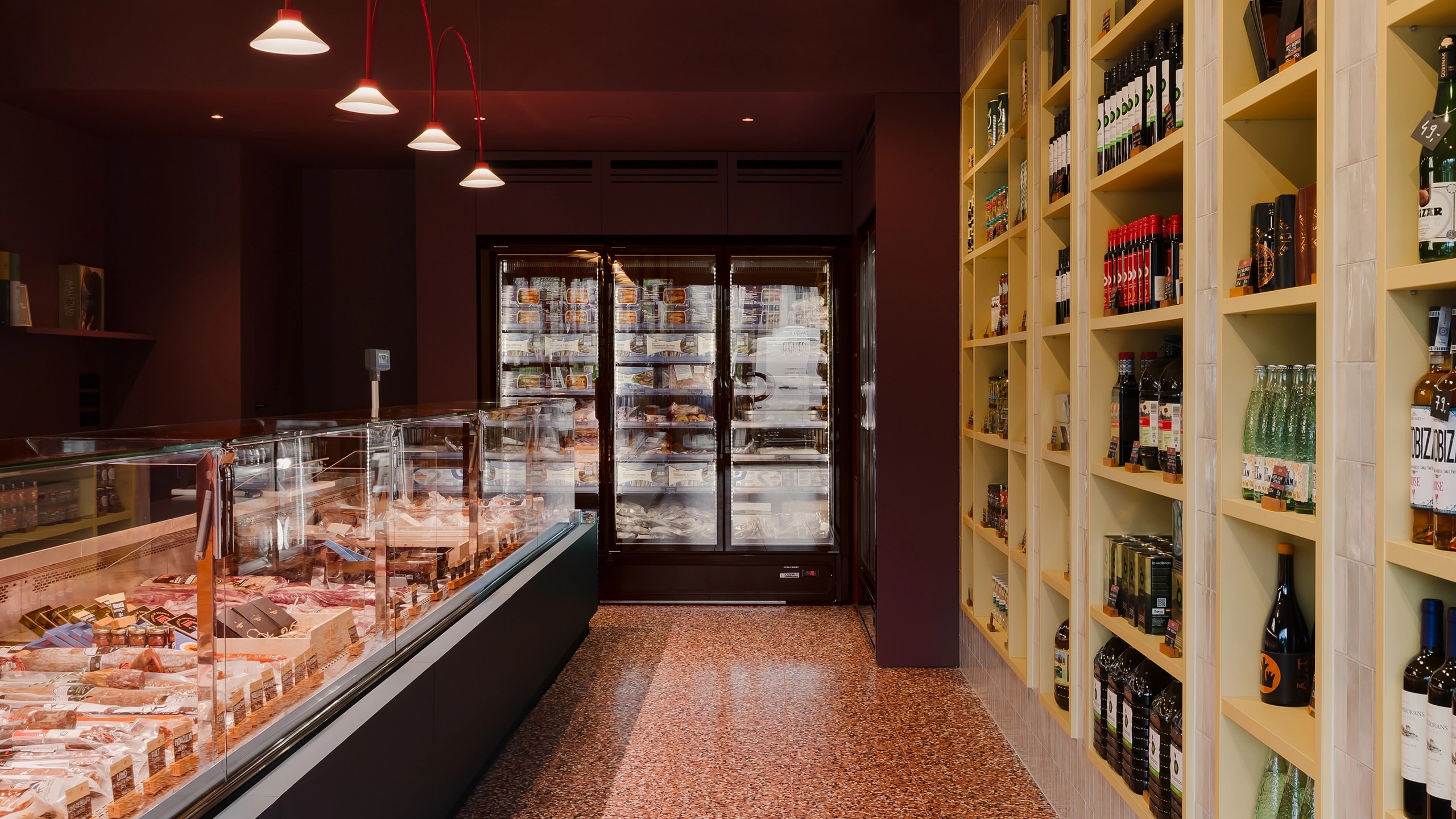
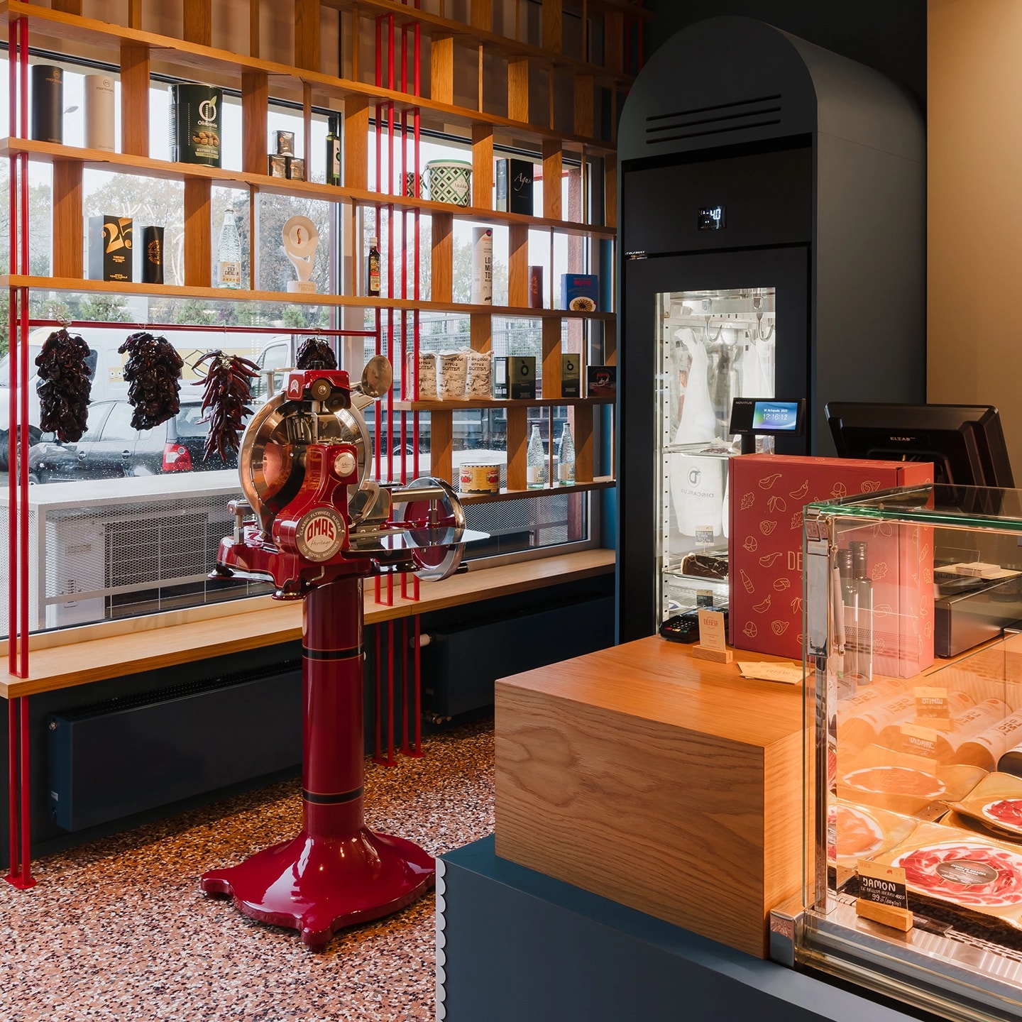
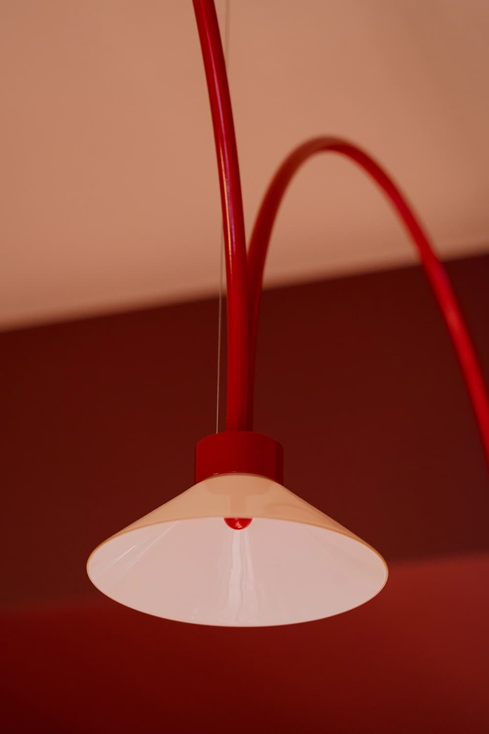
In a sun-filled interior radiating warmth and authenticity, one finds the atmosphere of a traditional Spanish delicatessen. A colour palette drawn from Almodóvar's films lends the space a contemporary character. The design combines sea navy, burgundy and yellow, complemented by strong red accents that echo the old-school slicer visible right from the entrance. Each colour marks out a different section of the shop and brings order to the space. The interior is graced by a timeless, uniform floor of custom-made terrazzo tiles, their mix of aggregates and colours composed specifically for this project. The heart of the deli — a vast counter — is accentuated by decorative lamps designed especially for this interior and made by a Wrocław lighting manufacturer. Red arches paired with delicate beige glass shades, each crowned with a small sphere, lend the interior a retro charm.

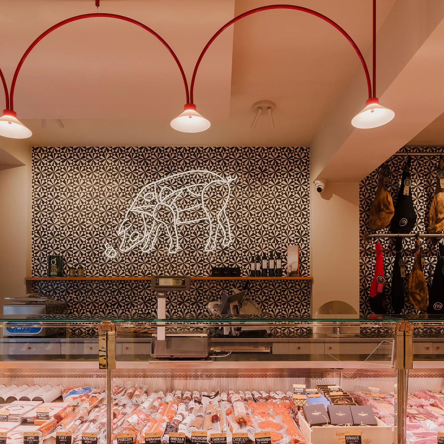
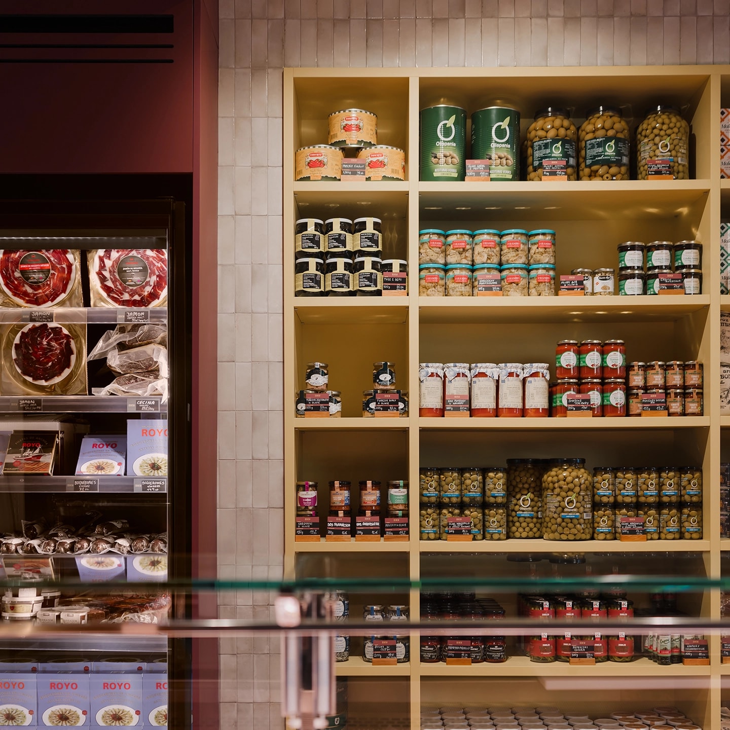
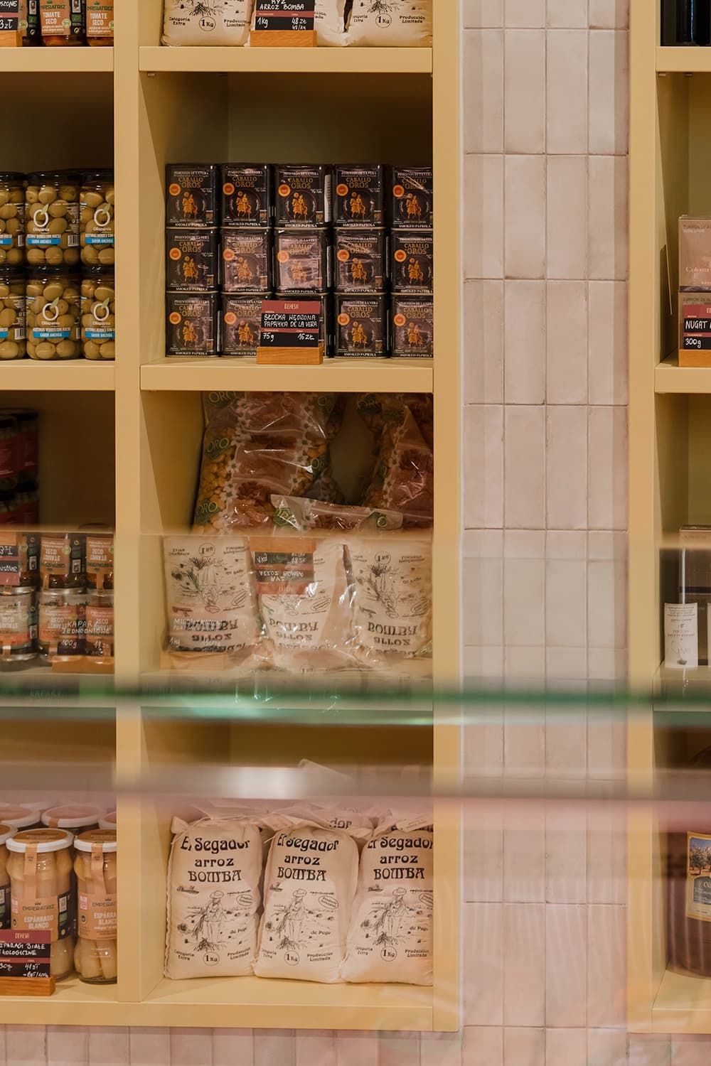
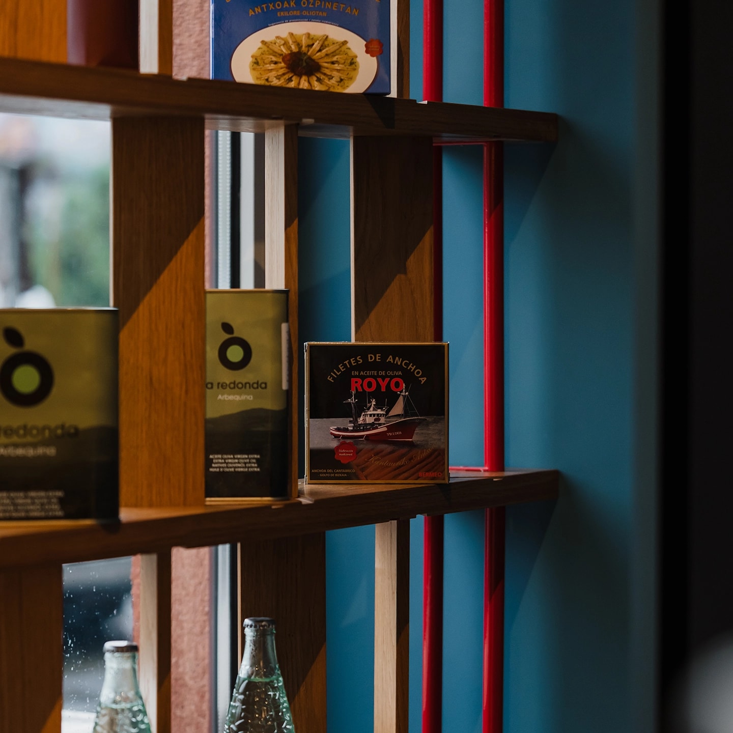
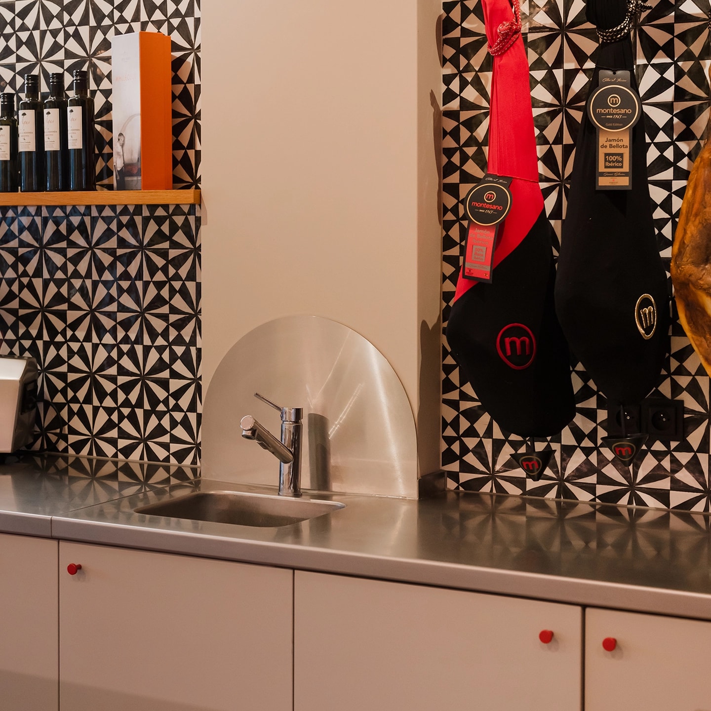
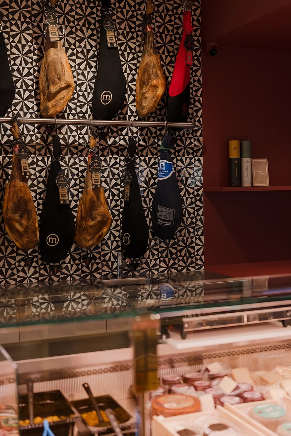
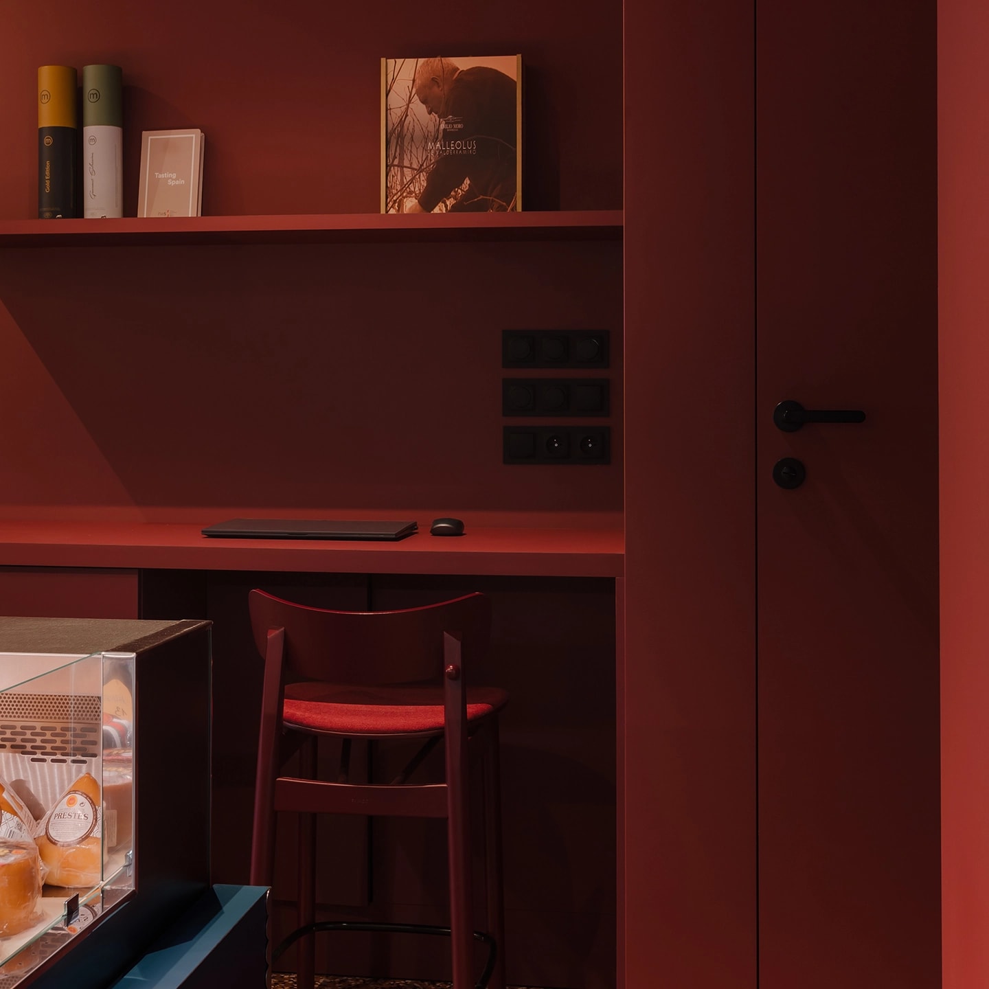
In a nod to traditional Spanish shops, the wall behind the counter is finished with decorative tiles in a classic black-and-white pattern. At its centre hangs a neon sign depicting the characteristic cuts of iberico pork — the most important part of the offering. Further along, Spain's signature long-cured jamón hams are displayed on steel rails. Niches designed within a built-in unit clad in small, irregular tiles in shades of beige take the place of conventional shop shelving. They hold carefully selected balsamic vinegars, olive oils, wines and other specialities that complement the offering at the counter. At the back of the shop, in a zone accented in burgundy, there is a section with high-quality frozen products and a small office nook. This colour break visually shortens the elongated interior. Owing to the nearby car park and strong sunlight, a honey-toned wooden rack stands in front of the shop window, serving both as the venue's calling card and as a screen against excessive sun. Crafted with attention to detail, its precise milled grooves allow the number of wooden louvres to be adjusted as needed.
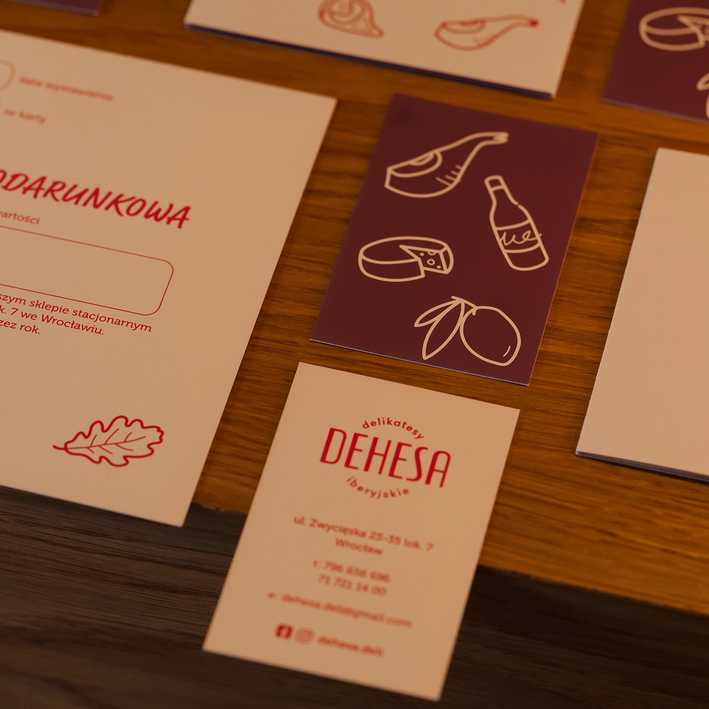
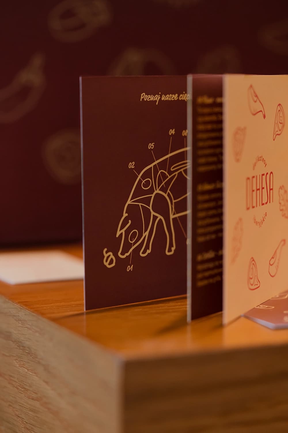
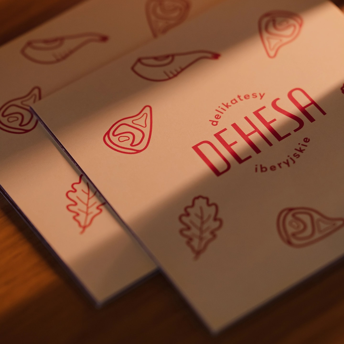
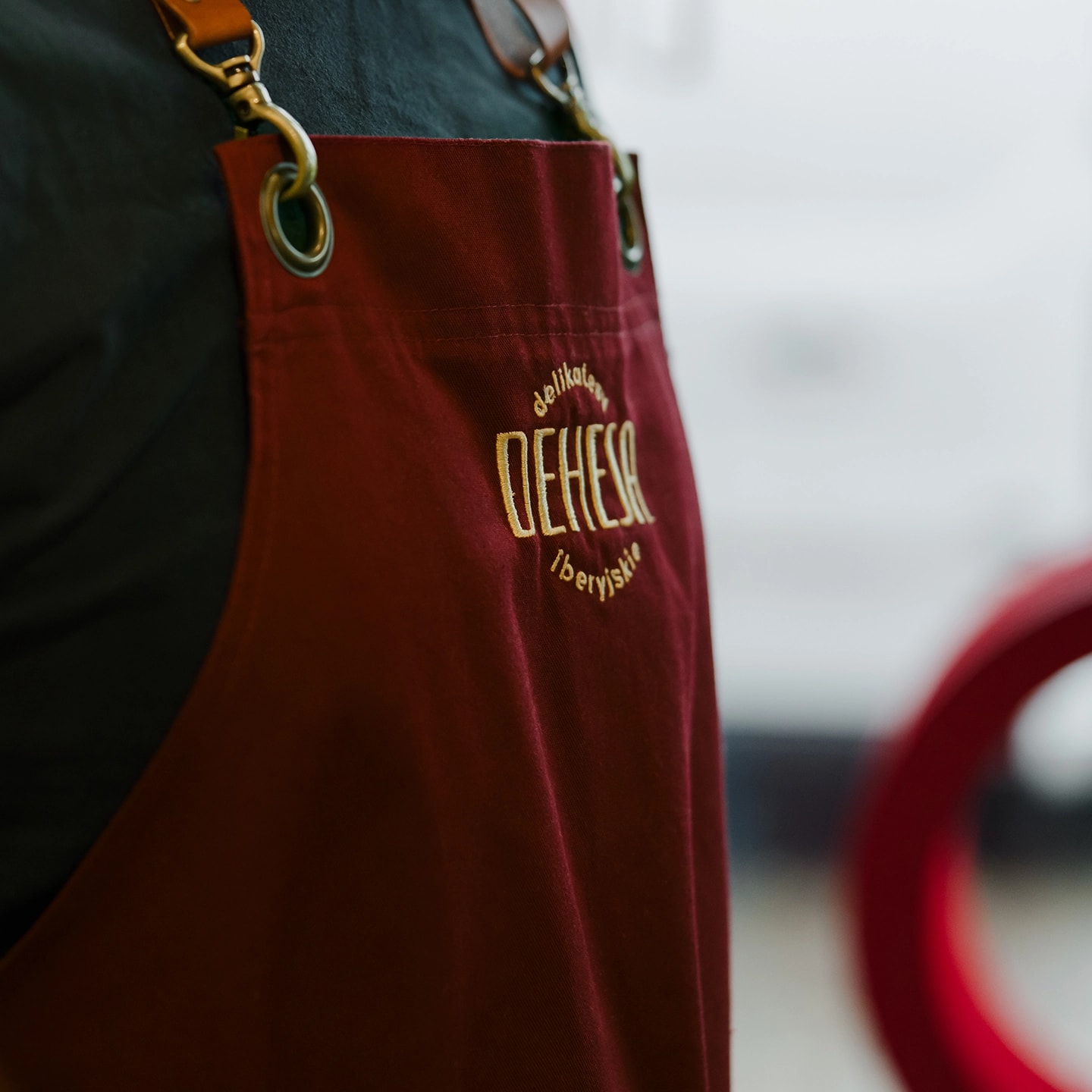
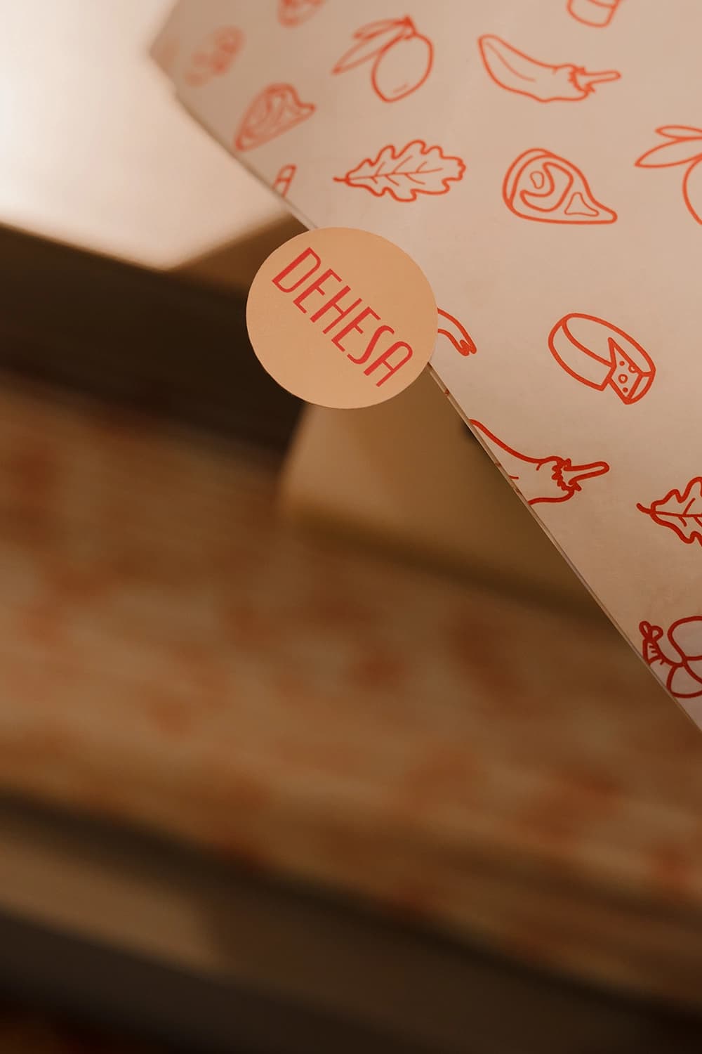
The concept was completed with a visual identity that keeps to a colour palette echoing the interior. The logotype recalls classic Spanish shop signs and is accompanied by a series of simple illustrations referencing the deli's principal products. The pig motif from the neon sign was carried over as a graphic onto printed materials. The uniforms — navy T-shirts paired with burgundy aprons finished with a subtle leather accent and yellow embroidery — harmonise with the shop's interior.